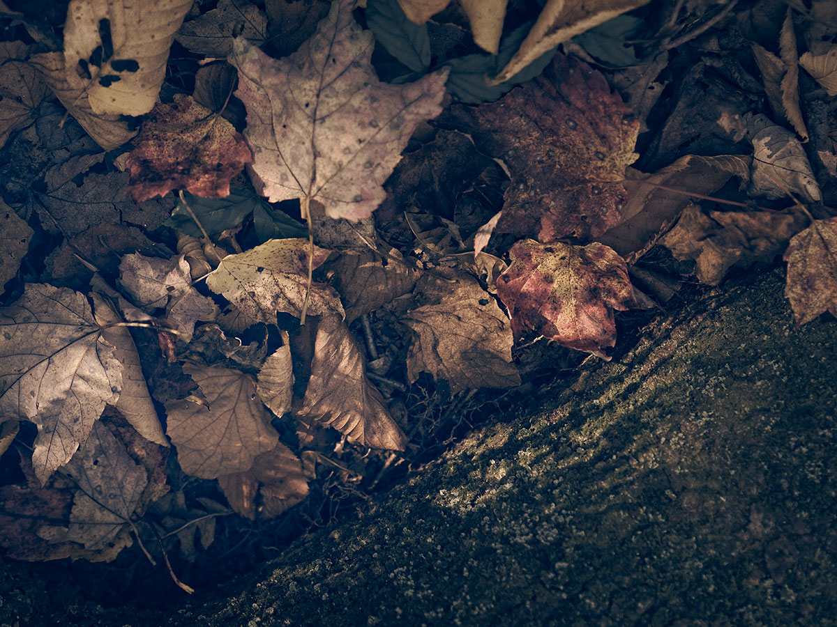
I love this. In the first photo the light and textures are remarkable; the leaves compositionally cradled. The second and third photos illustrate the title perfectly.
Excellent!
Thanks for those thoughtful words. One thing about the triptychs that’s worth noting is that my gallery format is intended to be seen on a computer, and it can be formatted differently on a cellphone, depending. As I’m sure you’d agree, most of our visitors are on their phones, so I try to view the post in both formats ahead of time and aim for a reasonable balance.
You’ve just reminded me that I need to consider the viewing experience, something I’ve been meaning to do for a long time but never got around to. It’s irritating! 😉
The way all the fine detail of the leaves slowly disappears into the murky, inky decomposing muck is fascinating.
The viewing experience is easy to overlook, and unfortunately a big part of it is totally beyond our control: the lack of color calibration from monitor to phone to iPad etc. It’s best if you don’t think about it too much! 😅
Yes, so true! I’ve thought about color calibration and viewing size more than I’ve thought about things like the way gallery groupings line up. Regarding color I decided long ago that it cannot matter, as you said, because we have no control over it. People see what they see, they like what they like. Joe was red/green colorblind so even on my monitor, he saw entirely different images than I did. But he enjoyed gallery and museum visits as much as I do.
But you’ve thought about these things for years after selling prints at shows for so long. You could tangle yourself up in knots trying to tease out different aesthetic preferences. 😉